You know the expression, “If a tree falls in the woods and no one is there to hear it, does it make a sound?” There’s an equivalent when it comes to data presentation: “If you put compelling data into a mediocre presentation, will your clients be convinced to keep you on retainer?”
When digging through data takes up so much of your time, it’s easy for data visualization to be an afterthought. But it actually plays a significant role in establishing trust, proving your value, and keeping your clients happy.
These 10 tips will help you use fundamentals of human psychology to craft data visualizations and presentations that resonate.
#1: Tell a story with your data
People are more inclined to listen to what you have to say when they feel invested in a structured storyline. It’s why we love to watch films, but quickly lose interest when our friends tell a scatterbrained story about “that one time in Vegas.”
Use your data to craft a presentation that doesn’t just present information, but also guides your client toward a truth or solution for a problem. Use tension strategically to both keep their attention and keep you in control of the room.
#2: Pick a topic and stick to it
Tailor your data visualization choices based on who you’re presenting to and what they care about. A money-minded COO, for example, probably doesn’t care much about how many impressions your display ad campaign earned, but they’d love to know how many new leads the website earned during and after the campaign.
Choose the metrics that will resonate your audience, and leave out any fluff — it’s distracting and will take away from your core message.
Learn more about how to avoid vanity metrics in your reporting
#3: Branch out from pie charts
Pie charts can work sometimes, but there are more compelling and strategic ways to present your data to clients. Before you plug data into a graph, ask yourself what your goal is with this chart or graph. Demonstrating change over a set time period could use a line graph, whereas comparing two lead generation channels could use a bar graph.
Once you’ve determined your goal, you can choose the right graph or chart to most effectively convey insights to your clients. (For some funny examples of what not to do, pay a visit to Bad Graphs.)
#4: Avoid subjective language
Your clients want concrete results, so avoid vague language that doesn’t incorporate specific numbers or percentages. For example, saying “PPC generated the most leads” isn’t as compelling as saying “PPC increased lead volume by 23 percent” or “PPC generated almost 1,000 leads.”
Pair this strong language with an equally strong chart, and your clients will have a clear picture of the value you provide for them.
#5: Less text, more talking
When presenting data, you want all eyes on you — that’s a difficult feat when your audience has to read through a mountain of text on a slide. Instead, stick to succinct phrases that are backed up by relevant visuals or graphs.
You may be wondering: What about bullet points? In general, bullet points are to be avoided because they allow too much text on your slides. But they aren’t always bad, and sometimes they’re necessary if you’re on a time crunch or your audience will reference the presentation later. In these cases, keep each bullet point as short as possible. (As a rule of thumb, if the text in the bullet point wraps to the next line, it’s too long.)
You can also use animations strategically so that your audience focuses on one idea at a time. In Powerpoint, you can do this by transitioning in each bullet point one at a time, while dimming the previous ones.
#6: Avoid sending your presentation slides
If an audience needs your slides to remember or understand what you talked about, chances are your presentation wasn’t sticky enough. Plus, if you have a human-friendly presentation, your slides won’t have enough text to be of much use anyway. Focus first on creating a people-friendly presentation filled with intuitive data visualizations.
Of course, there are situations where you’ll be required to provide handouts, and sometimes handouts can be helpful if the presentation topic is complex. In these cases, data visualization expert Lea Picarecommends creating a handout based on your presentation instead of just sending your slides. Check out her helpful guide for converting presentations into handouts.
#7: Use color strategically
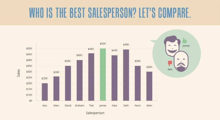
Humans can only retain so much information in their short term memory, so make sure you’re not adding any distractions with your color choices. A good rule of thumb: The simpler, the better. It can be tempting to create an aesthetically pleasing chart or data presentation that uses lots of color, but it just adds noise that takes away from your ideas.
Instead, stick to only a few colors and employ them strategically for emphasis. In a chart, it would look something like this:

In your titles, you can use color to emphasize important takeaways.
#8: Establish trust through your data visualizations
As an agency, it’s crucial to ensure your clients trust that you’re presenting their data in an honest, ethical way. There are several subtle ways you can convey trust in your charts, but one of the easiest ways is to always include a source.
Even if the source is just the client’s own Google Analytics data, it subtly reminds them of your transparency and affords you more credibility as a trusted partner.
#9: Know the cultural differences in design
If you work with clients from other countries, make sure you do your research on cultural differences in design, especially when it comes to colors, text direction, and typography.
For example, in China, the color red conveys positivity and growth, whereas green conveys negativity and decline. However, for western cultures, the meanings of those colors are reversed — green conveys growth, and red conveys decline.
Keep these differences in mind as you create your charts, and steer toward culturally neutral colors and typography whenever possible.
#10: Include recommendations
Once you’ve crafted a compelling narrative — complete with psychologically appealing aesthetics — you should offer recommendations and next steps based on the data you’ve presented. Your recommendations are the resolution of the data story you’ve crafted, so make sure the suggestions are clear, reasonable, and practical for your clients.
Successful data visualizations and presentations always keep the audience in mind and use human psychology to their advantage. Add a sprinkle of storytelling, and you’ll be more effective at proving your value to your clients.


