


Session Transcription
Introduction
My name is Jon MacDonald. I'm the founder and CEO of The Good. We are a conversion rate optimization firm and today I'm going to talk to you a little bit about conversion rate optimization, as well as complete a website tear down.
Dr. Karl Blanks, the inventor of the term conversion rate optimization once said that, "The average webpage is designed less scientifically than the average toilet brush."
The majority of website design and copywriting is still in the pre-scientific age, and most web designers rely on inspiration, not experimentation and this is a problem. Today I'm going to show you how to fix that.
The Good's mission is to remove all of the bad online experiences until only the good remain. And that means I need you to change your websites for the better. The outcome will be higher conversions. Through our mission at The Good we've been able to help eCommerce companies increase sales for over 11 years now, including Nike, Xerox, Adobe, The Economist, and many, many more.
Today’s Agenda:
- Understanding the 4 key data types
- Live website audit
- Q&A
First thing we're going to do just so we can establish a baseline between us, is we're going to talk a little bit about key data and how you should be making data-backed decisions.
There are four key data types or groups of data that we utilize in conversion optimization:
- Analytics: This includes site usage analytics like Google Analytics, but it also includes things like top sellers, revenue, numbers, seasonality information, paths through your site and lots and lots of other types of analytics data.
- Heatmaps: This includes things like scroll maps, click maps, session recordings, eye tracking, and other types of movement and engagement maps. It tells us how people are engaging with content on the site.
- User Testing: This allows us to observe real individuals using a website and talking out loud about their experience. And while they're doing this, we're recording their screen and their audio. Now we formed a pool of hundreds of thousands of trained test subjects, all trained to speak out loud about the experience they're having and what they're thinking as we give them these tasks to do. Now this testing helps us to understand what a visitor is thinking, not just what they're doing, which is what analytics can tell us. The goal here is to understand why, not just the what, that those quantitative data points provide.
- A/B Testing: We use onsite A/B testing to statistically test what changes on the site will produce better results. How does conversion optimization utilize all this data? Well, we know that data tells us what is happening. We use all of these sources together to help us understand why that's happening. And we look for patterns that help us to develop insights on user behavior. Then we use all of that data to inform hypotheses about why particular behaviors are occurring and how we can use those to impact future behaviors. And finally, it helps us to design onsite experiments and tests that give us really a better insight into that consumer behavior and experience.
Let's put some of this data into action and let's see how we can use just one data point, which is going to be an eye tracking heatmap to start optimizing a site quickly.
Live Website Audit
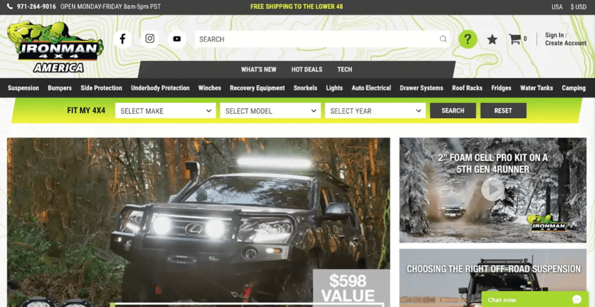
We're going to take a look today at Ironman 4x4s website. We'll look at their products and we're going to look at both their homepage, and if we have some time, we'll also look at their product detail page.
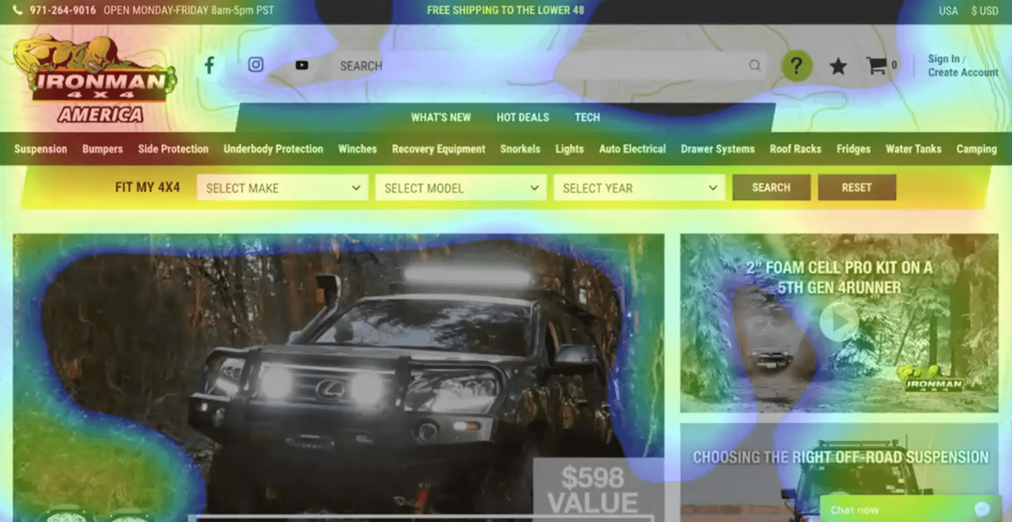
What we're going to do is look at one data point as a basis for this assessment. That data point is going to be eye tracking heatmaps. We're going to start at the very top of every page that we review and we're going to work our way down to the bottom.
I want to be clear that these are all recommendations for things that we would suggest running A/B testing with on the site. Think of these suggestions as suggestions for A/B tests that should be run on the site.
Homepage Analysis
Let's jump in with the homepage. What do you notice here using your own critical eye? Take a moment, review it briefly.
Now here's the heatmap. If you're unfamiliar with heatmapping, heatmaps visualize areas of a webpage from hot to cold, hence the name. Darker red is where the eye (mouse) spent the most time looking and then it cools off from there. It goes from red to yellow, to green, to blue. Gray is where nobody looked at all.

Let's start at the very top of the page. We'll work our way all the way down to the footer. The first thing that you'll notice here is that there are at least seven actions that they are asking the visitor to take before they've even started scrolling down the page:
- Content information
- Social icons
- Search bar
- Navigation
- Hot Deals
- Fit my 4X4 (enter your jeep model)
- Chat bot
There's a lot of things going on here that the user has to comprehend before they even really understand what the brand's selling and what the value proposition is.
Contact information
Having your phone number displayed on your website is really good, but usually we'd recommend just putting that down on the footer as that’s where people are going to look for it. Additionally, we have run a lot of testing on having phone numbers in the header.
The problem becomes that consumers immediately assume your site can't fulfill an order completely on the website and that they have to call to fulfill the order. That creates obviously a big issue. Not only are you reducing your return on ad spend, but you're also reducing your margin because you're now getting a human involved in something that could have been done fully electronically.
Social

Search bar
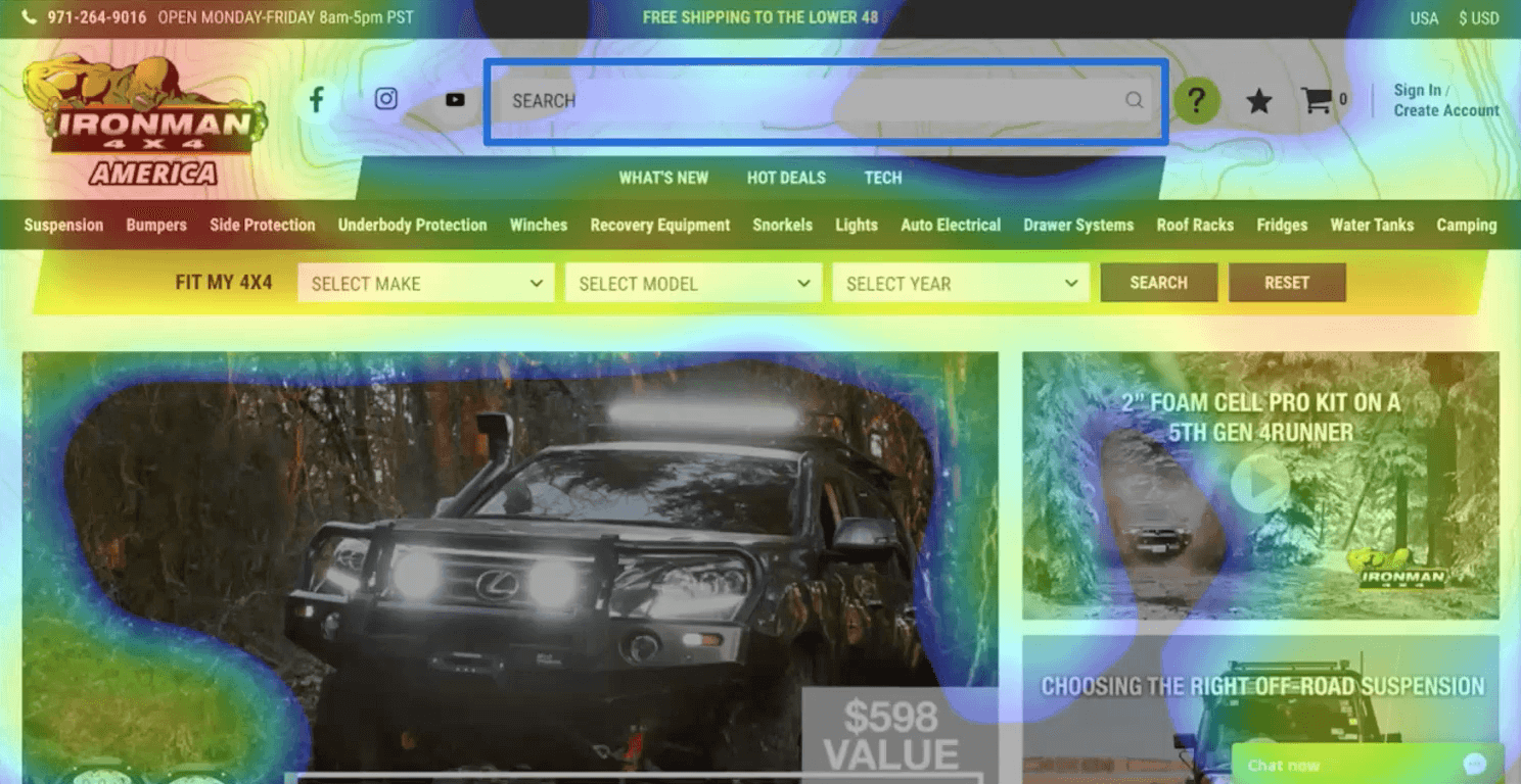
This is really an easy win for everybody in how you can immediately increase your effectiveness of search. Track and know your top five searches. What are folks searching for on your site? This is usually pretty easy to find in Google Analytics (depending on your eCom platform). A lot of times, you can just search for the query string S equals, something of that sort would be pretty easy to find what those searches are. The problem is most brands have not optimized their search results in any way or that search results page.
It's really important because people who search on your site are going to convert at least twice as more often as somebody who doesn't search. It's a really high converting activity, so you really want to make sure that you're at least looking at that and optimizing that.
Navigation
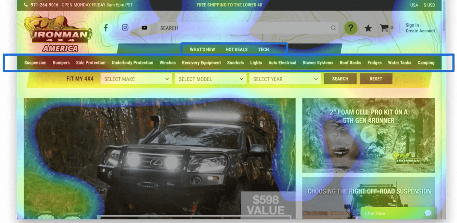
I would not recommend having any more than five navigation items in your main navigation. Anything more than that results in the activity that I just mentioned.
Fit My 4x4

This is a big issue and this is where heatmaps really can come into play. It shows us how people are engaging with content, what that looks like. I see a big concern here and until this point, it's really hard to decide, especially if somebody is looking at the navigation and doesn't really understand what the value props are and what's been sold on this site specifically.
Pop-ups
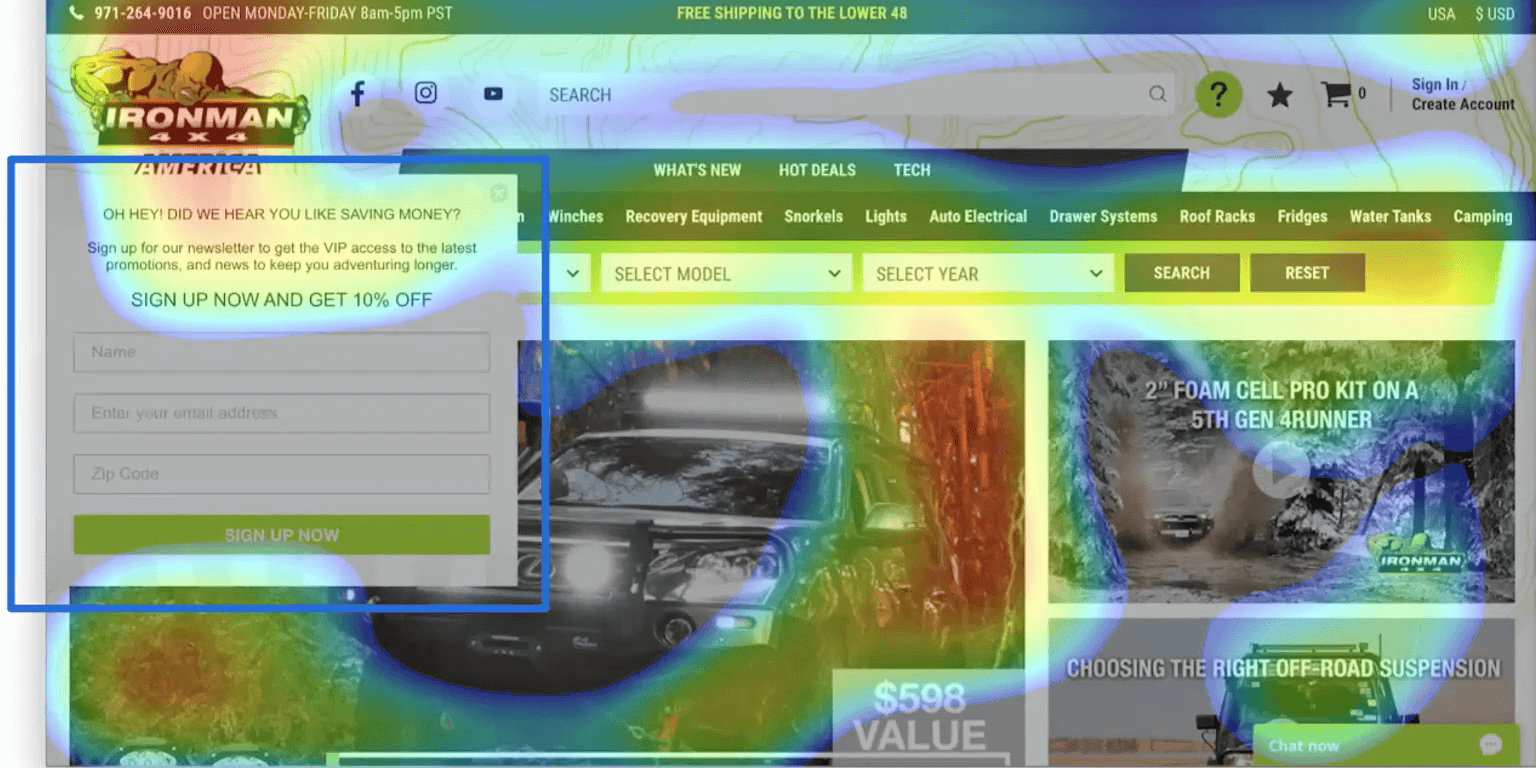
1. Be cautious with your disruption
At least this isn't a full screen popup that's just covering all the content, but it's still very disruptive. If you must do a popup, you need to have a couple of different things on here. They're missing privacy and reassurance. What do I mean by that? Well, there's no privacy statement saying we won't share your information. We won't sell your information. You need to make sure that you are letting people know what you're going to do with their information.
In terms of reassurance, what are they signing up for? Here it says sign up for a newsletter and get VIP access and news to keep you adventuring longer. Well, that's great but how often are you going to email me? Is it once a week, once a month, every day? What am I signing up for here?
2. Be wary of discount customers
I have a challenge around discounting for emails. Collecting email addresses on your website should be a priority, but you shouldn’t be doing it in exchange for a straight percentage or dollar off discount. There are a lot of better things you could do here and I would argue that having VIP access to the latest promotions is probably key enough to get people to subscribe, if they really are interested in your content.
Offering a percentage off, creates a discount customer. They now view your brand as the discount brand and they are forever a discount customer.
Chat (should never automatically appear)
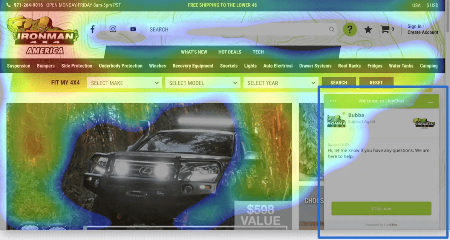
Think about your site like a retail store. If you wouldn't do it in retail, don't do it on your website. Just like in a retail store, give the consumer time to browse, then let them know you're there to help if needed.
But what's the worst retail experience? When you walk into a store and immediately a sales associate jumps out in front of you and says, "How can I help you? Let me show you around the store." That is something that if you've had a little chance to orient yourself, a friendly, "Hey, thanks for coming in today, if I can help you let me know," that goes a lot a longer way at that point. The same nuance needs to be given to your eCommerce website.
Keep your CTAs clear
These categories are getting a lot of engagement and this could be a good option to leave these and perhaps get rid of that main navigation bar as we discussed and even the sale items and just get them right into the categories, after you do a little bit of maybe promotional lifestyle or branded content. Again, we're missing a clear call to action on these. It looks like a listing of categories with no buttons.
The thing to understand here is that we've trained visitors on this site from the very beginning to be looking for green buttons, those green rectangle buttons, because that's what everything else has for a call to action. All of a sudden we're left without those call to actions. You're really confusing visitors, even if they have to think about it for a moment and then realize they can click on these to keep moving forward, that is a disruption. We want to eliminate that and grease those wheels as much as we possibly can.
Leave only The Good
As I mentioned before, I do this presentation because of our mission to remove all of those bad online experiences until only the good remain and I implore you to take at least one of these actions. There are three things that you could really do immediately to help improve your site and to help remove all those bad experiences:
- Ask for an outside opinion
- Sign up for our Landing Page Teardown
- Sign up for weekly insight emails
First, ask someone new to look at your site and just tell you what they think. Select someone in your target audience who's never seen your site before, set up a quick Zoom call. I'm sure you could do a little bit of research on a user group or something that's relevant to your brand. Put a call out on Twitter, do a little bit of research for a phrase or relevant tag on Twitter and you will find consumers who fit your target market, but are unaware of your brand.Ask them if you can give them a discount or a gift card, even send them a Starbucks gift card, something of that sort to do a quick Zoom call, if you will.
All you need to do is ask them to observe your site and tell you what they think as they're going through. Give them a high task, like find the best refrigerator for your 4x4, and then they will go in and use your site and just sit back and record the call and watch and observe. You will learn so much. I often say that brands are too inside the product to really understand the issues. It's really hard to read the label from inside the jar. It means you're too close to your site to truly understand what the consumer is thinking.
Secondly, you can sign up for your own landing page tear down, if you go to the URL here, thegood.com/LPT.
And third, you can sign up to receive our weekly insight emails. These are tips and tricks on how to better convert people on your website. We send this out every week. We've been doing that for seven years straight and I promise you it's never sales content, it is always just a helpful article, a research report every week. And to follow my own advice here, we will never sell or distribute your email address and you'll hear from us once a week. Now please choose at least one and commit to doing it today.
Q&A
1. Is the heatmap that you used a function of what people have clicked on a lot or what goes into your heatmaps that you were describing?
There's several different types of heat maps. There's heatmaps based on mouse movement. That's generally what people mean when they talk about heatmaps. Tt's based on where the mouse is on the page, which can be good because generally on a desktop, your mouse is going to follow your eyes and vice versa. You have a decent understanding of how people are engaging.
There's scroll maps that tell you how far down the page people are scrolling and there's click maps that show you where people are clicking, and so what we use and really like, is eye tracking. So this is based on eye tracking, where we send people to the website and it helps us understand how people are looking at the page as opposed to just using mouse movement, and that's become a little more common as there's more devices out there as well. It's been much more helpful to collect a better data set. Eye tracking is what the heatmap is based on, that we looked at today.
2. I find that most leads that convert to paying customers contact me over the phone, so making my phone number of priority is still okay. I'm a service business, not e-commerce.
Yes, having your phone number on the site is a priority and it should be there, and my point about having it in the top left is it's the first thing people see. Now, if they want to learn more about you, they're likely on your site to do a little bit of research. If you're an eCom site, they're there to purchase. Research and then purchase.
For B2B, you definitely want your contact information on your site as clear as possible, and that includes your phone number, of course. For a B2B or lead-gen site, obviously a phone number is a little more important in terms of having that front and center. eCom it can be really, really helpful as well, especially for people who maybe can't find the right part, right? I can imagine the reason that Ironman 4x4 put their phone number in the top left is because they get a lot of questions before people want to purchase, just to make sure that it's the right part, et cetera, for their 4x4.
That can be really helpful. My initial thought though, is for an eCom site, don't put it in the top left and even for a B2B site, I would most likely look at putting it in the top right, if you really need it there, otherwise know that people will still scroll to your footer to get your phone number.
Digital Marketing Boot Camp | Logical Position:
- Session 1: Adapt Paid Social Strategy During COVID-19 | Emma Huschka
- Session 2: Integrating CallRail with Google Ads: The Do's & Don'ts | Josh White
- Session 3: Optimizing Call Tracking | Tim Benson
- Session 4: Conversion Rate Optimization: Website Audit | Jon MacDonald
- Session 5: Importance of Email Marketing | Jeremy Vale
- Session 6: How To Grow In A Down Economy | Ryan Garrow


